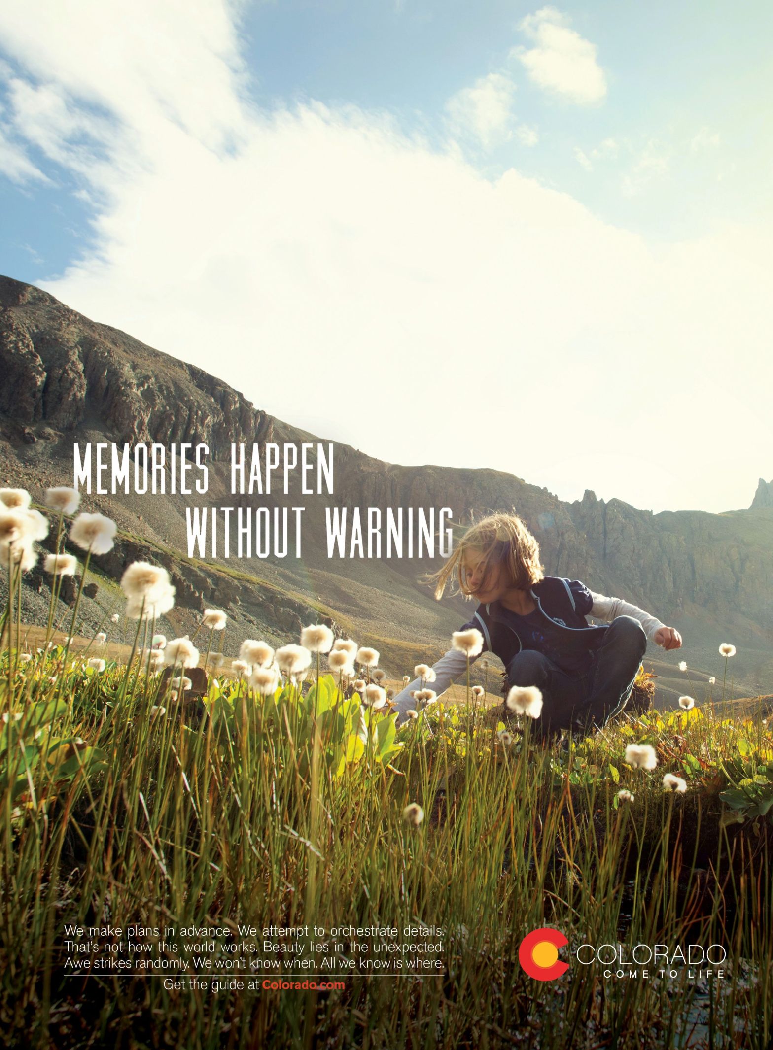
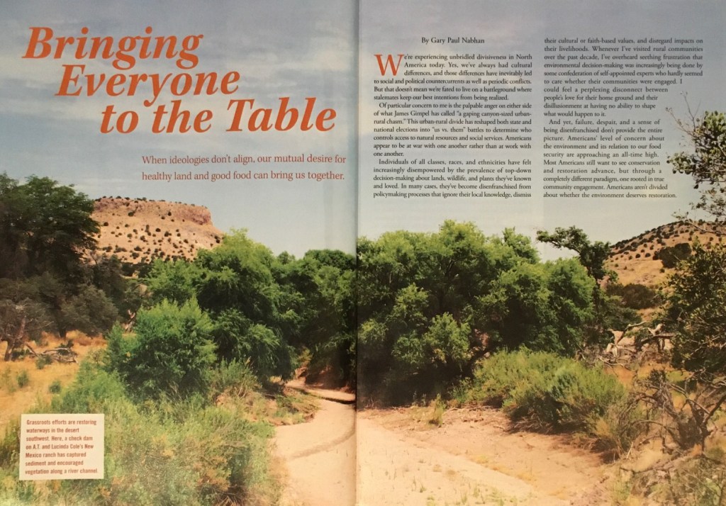
This capture of nature by A.T. Cole on his property displays several elements of design I am in search of understanding. The photograph is the highlight of an article found in the Mother Earth News February/March 2020 issue beginning on page 18. We see in the image and typeface many examples of the elements being taught in the Visual Media course I am currently taking at BYU Idaho under the direction of my fabulous teacher Sister Barney. These elements are subtle in this spread which provides a greater challenge compared to a more dramatic contrast of design.
Leading Lines and Framing

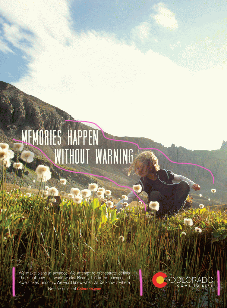
The curvy leading line draws the reader’s eye down the page to drive home the meaning of the article about our country and ideologies being divided. The photographer also utilized the principle of framing with the hills sloping down to the dried riverbed. The depth of field is represented as the images up close give perspective to the distant hills.
Typeface Analysis
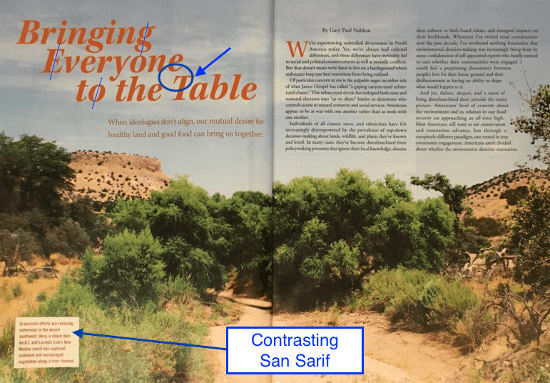
The main Modern heading, and the Oldstyle sub-heading of this page contain a few differences while also looking very similar. For example, the large and bold main heading shows thin, straight vertical serifs similarly to the smaller type-sized regular subheading while the form of italicized lettering creates the most noticeable contrast. The little differences are seen in the curve of the letter e and the different form of the letter a in the separate types.
Typeface Contrast
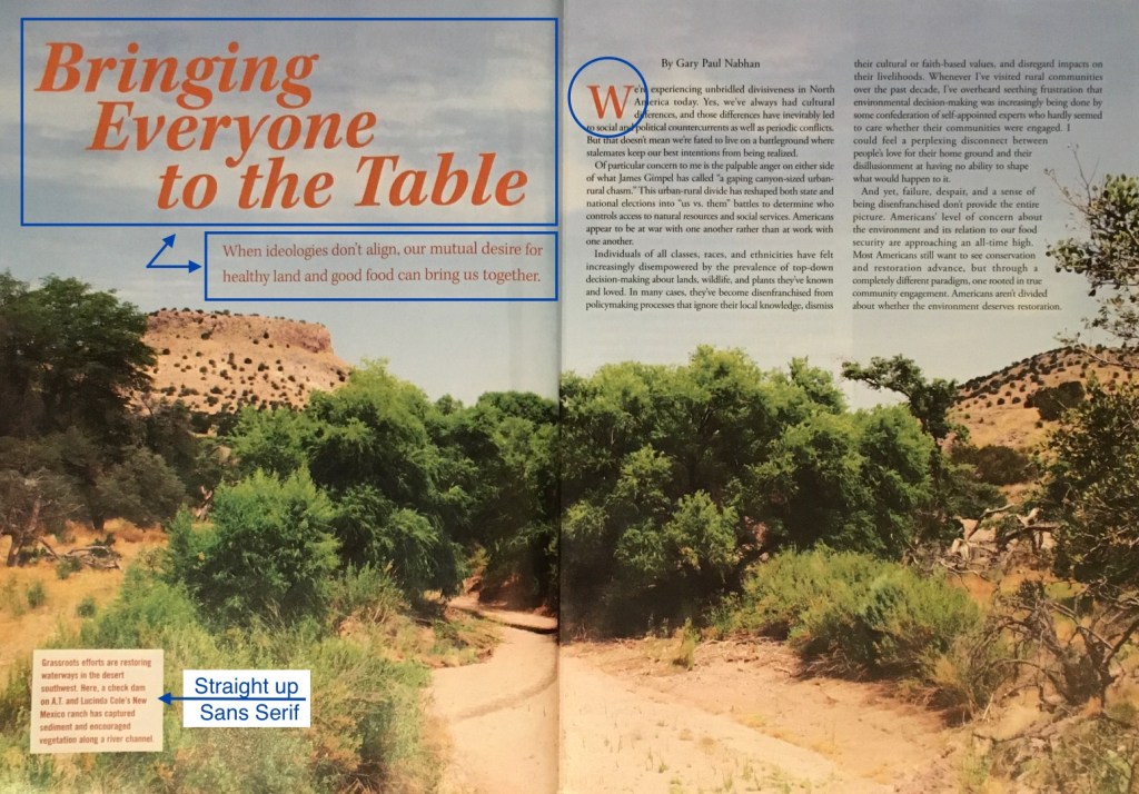
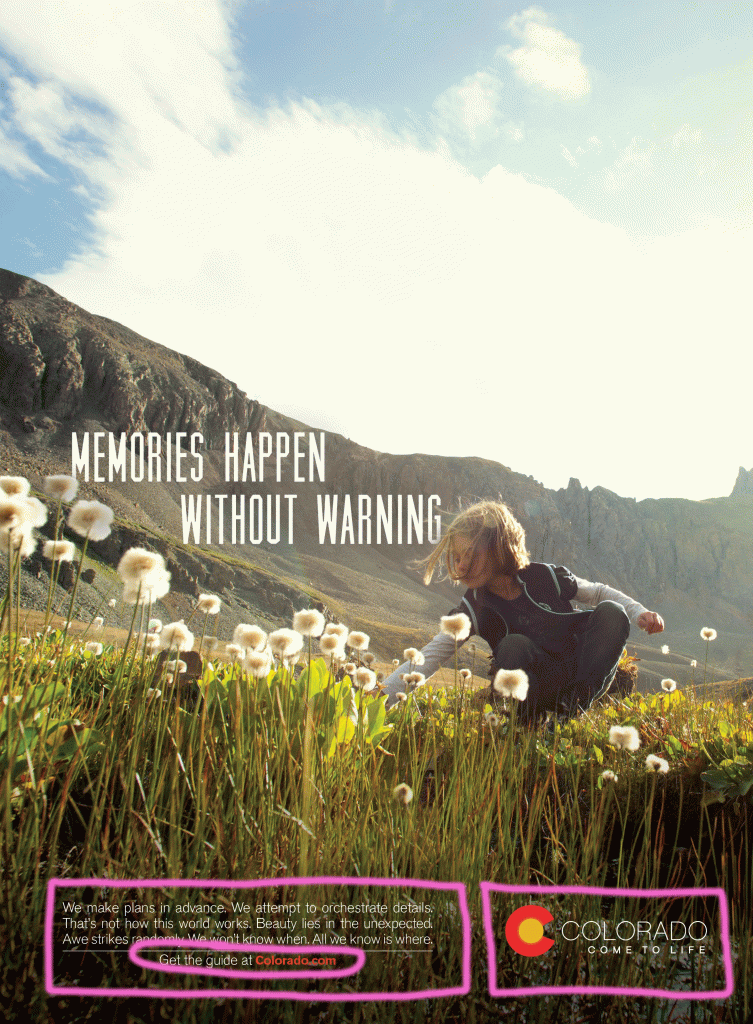
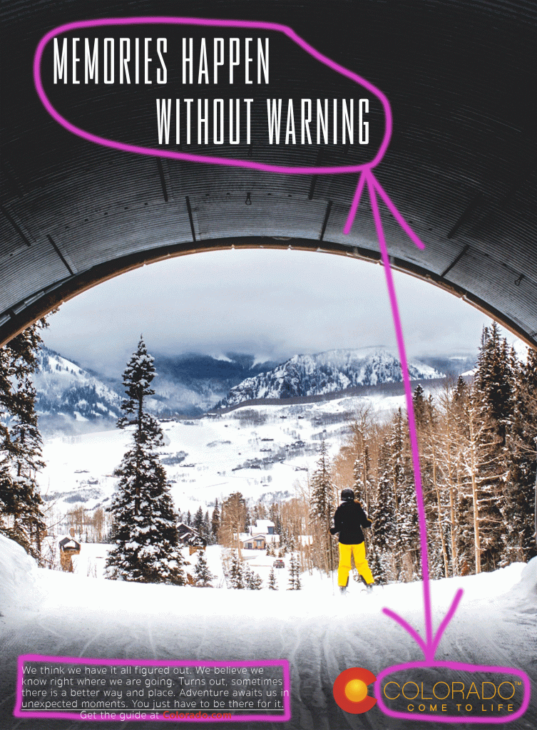
The type and color of the W is carried over to the article which provides a little repetition to the design of the spread. The textbox in the lower left corner of the page contains a contrasting Sans serif type, identified with their monoweight forms showing no serifs. Although it is small and separated from the body of text, it draws the eye with its relaxed line and letter spacing.
The Old Switcheroo
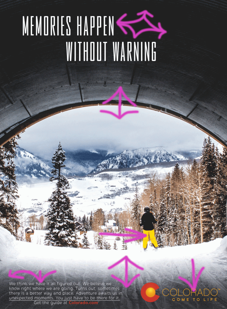
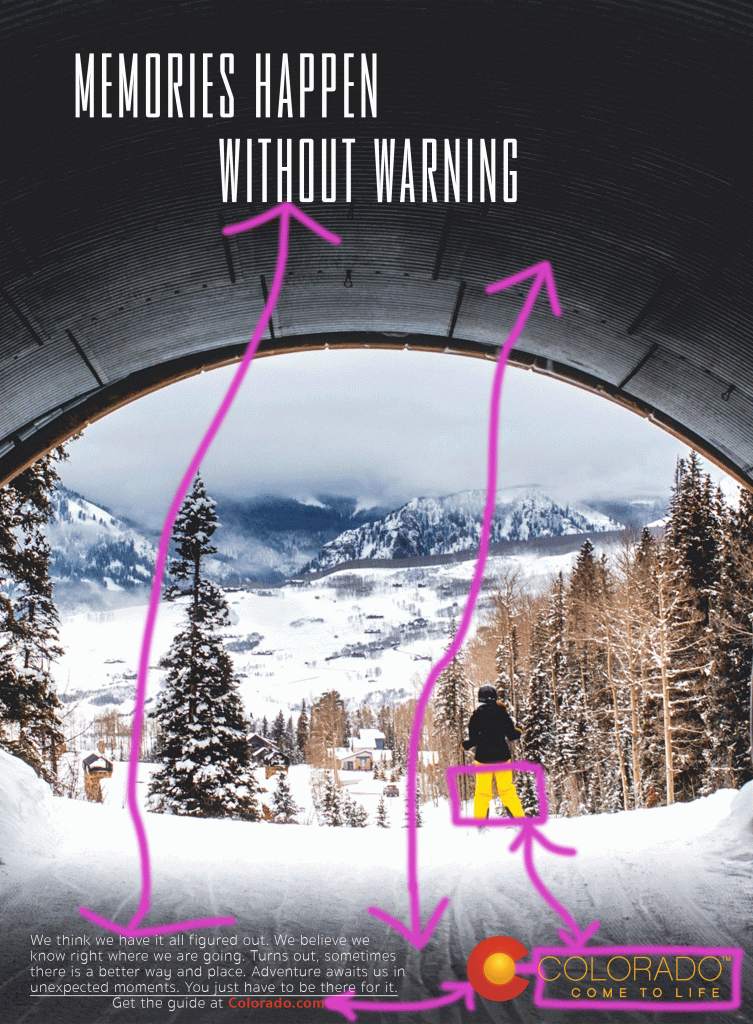
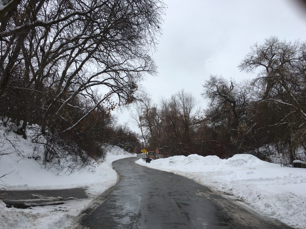
The following three photos mimic A.T. Cole’s photo in the way that there is a curving leading line toward another point of nature. These images depict a since of separation of the two sides yet they come together lower third center of the image. They similarly are of nature which relates to the human nature discussed in the original article. The depth of field is noticed as there are focal points up close and draw the eye to the objects in the distance.


To Conclude
The design of the layout can amplify the meaning of a message or idea being discussed. When words are applied to images, it allows our mind to think more abstractly. This is analogous to the way our Savior would explain principles of the gospel with parables.
We are blessed to live in a time when we can use our endless resources to create and design images that promote deeper thought and meaning to any topic.