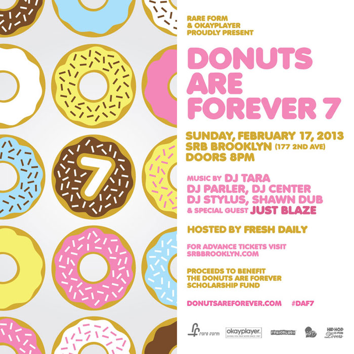
There are some great design techniques evident in this donut themed flyer created by Dennis de Groot and posted February 6, 2013 by okayplayer.
Two reasons why this flyer is excellent:
- Donuts, duh
- Dennis de Groot’s Design
Original Flyer
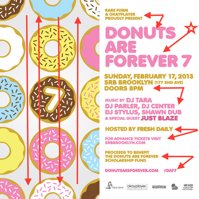
and now, for a demonstration
Alignment

The red marking indicates where the use of good alignment is in this design. The page is organized well in the way that the center line draws your eye to the details, without overwhelming your mind with needing to look around the page for the information. The text flush left to the image gives both sides of the page equal weight of importance. The images of donuts remind the reader of the annual gathering, while the text gives the details of the event.
Contrast

Contrast is used beautifully in this flyer. The pink and mustard colors against the white background are appealing. The choice of bold font sizes infer the points according to importance. The paragraph space between the different topics is refreshing and guides the eye smoothly from one topic to the next. The shade difference from the white background of the text to the slightly grey background behind the donuts allow for contrast with the white donuts. The dark contrast of the chocolate donut in the middle centers the title of the event in the image.
Proximity

Dennis de Groot totally nailed it in following the design rules of proximity. Two distinct ways are the paragraph space above and below each segment along with designated separation using alternating colors. The information is organized into relationships and make it abundantly clear to the reader the who, what, when, where, why and sponsors of the event.
Color

- The lighter tints of the primary colors give the event a feeling of the good old fashion fun that happens when donuts are going to be involved
- The contrasted colors alternating throughout the text gives defined relationships to the information
- The darker pink shade and slightly larger font size of the words Just Blaze sneakily showcase the main attraction of entertainment
- The donut colors help highlight the pink found in the text while giving a pop with the complimentary colors of blue and yellow
- The brown in the chocolate donut gives contrast to accentuate the 7th annual event while matching the sprinkles on the other colors
- In the sponsors segment at the bottom of the flyer the text is a darker shade of the slightly grey background of the image side of the flyer
Repetition
All the elements of design come together in these excellent examples of repetition
- The alternating colors repeat
- The font is consistent throughout the text
- The donuts are aligned perfectly
- There are three donuts of each color
- The white space is repeated evenly throughout the text as well as in between the donuts
- The alignment is consistent in both the text space and image and draw your eye to each designated point of information
