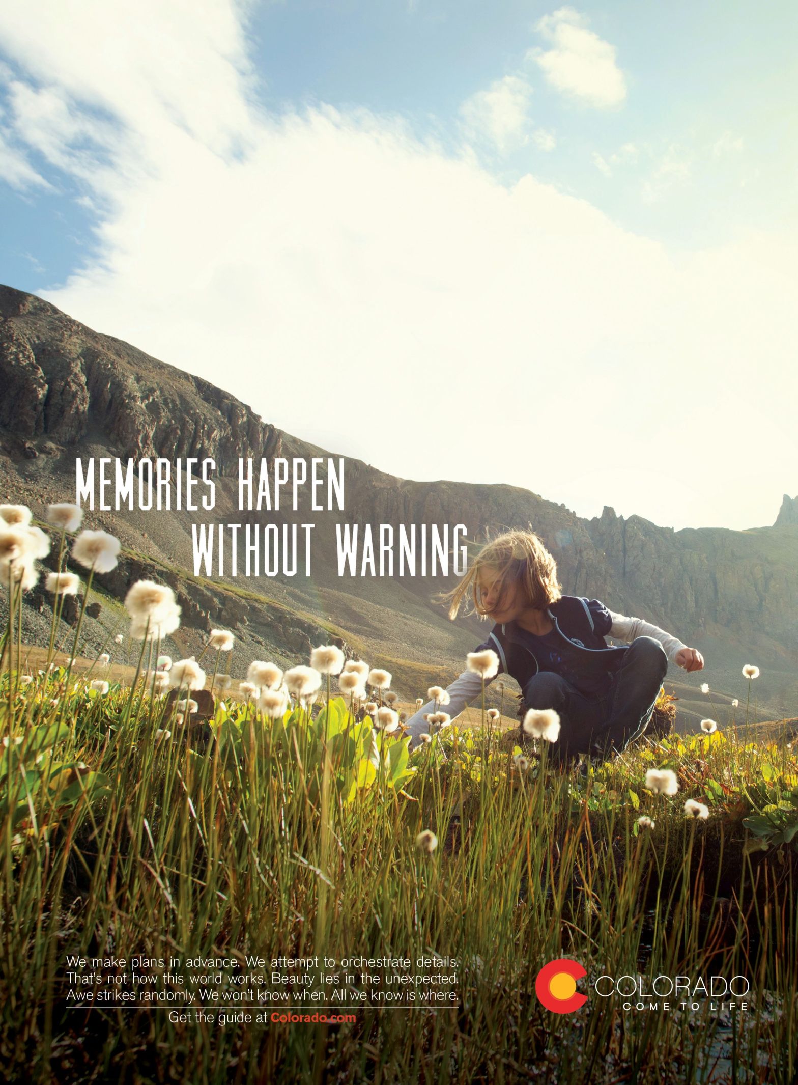

This advertisement conjures memories of fresh mountain air on a breezy spring afternoon and invites the audience to visit my native state of Colorado. It is designed in a way that brings you into the moment and welcomes you to walk around to the information while your mind plans your next road trip to make it happen for yourself. The original ad by Agency Network: Karsh Hagan in a Colorado Tourism Campaign was published/aired on March 2012 and posted December 17, 2012. It was slightly redesigned and published in Pinterest at https://www.pinterest.com/pin/335518240966734524/. Karsh Hagan’s vision of putting the audience right in the experience of Colorado with this ad worked brilliantly.
Let’s Dig Into the Design
alignment
The layout of this version of the ad uses the frame of the mountains above and the flowers below to guide the alignment of the type, which then leads to the girl who is experiencing her surroundings.
The paragraphs aligned along the bottom of the page are framed by the ground in the photo and the bottom line of the page. These two type boxes are in alignment with each other and create a solid foundation by creating a feeling, calling the reader to action and stating the brand.
proximity
The body of the text and the brand are in a great place of proximity. They are not impeding the peace and message of the image and they are together as an after thought beneath the main idea. The call to action is in perfect proximation as it follows the paragraph that is creating a vision of travel and peace, with the information of how to get there.
color

The repetative color of white are found heading, brand name, text body, the girl’s clothing and the flowers gleaming the backlight of sunshine. This color thread makes the movement through the ad clear and simple and keeps the message airy and light as to not draw attention away form the image. Another color detail is seen in the web call-to-action reference, repeated in the color of the brand logo.
typography

The typography in this version of the ad has some pros and cons. The sans serif of the body is thin and unobtrusive. I like how it is light and airy and plays into the rays of sunlight shining on the grass that it is laying in. The uppercase found in the main body text is consistent with the uppercase text of the brand name. However, the main heading text would be more attractive if it was a contrasting typography. I believe a nice script font would add some contrast and sweetness to the advertisment as a whole instead of the current techy sans serif uppercase font.
Now For A New Ad Analysis
This new ad’s purpose is to compliment the original. The excellent photo was taken by the extremely talented David Mark and can be found at Pixabay.com.
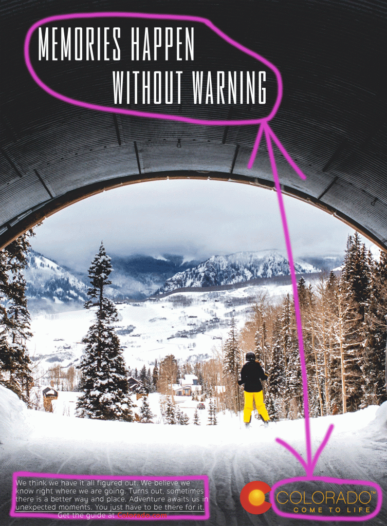
contrast
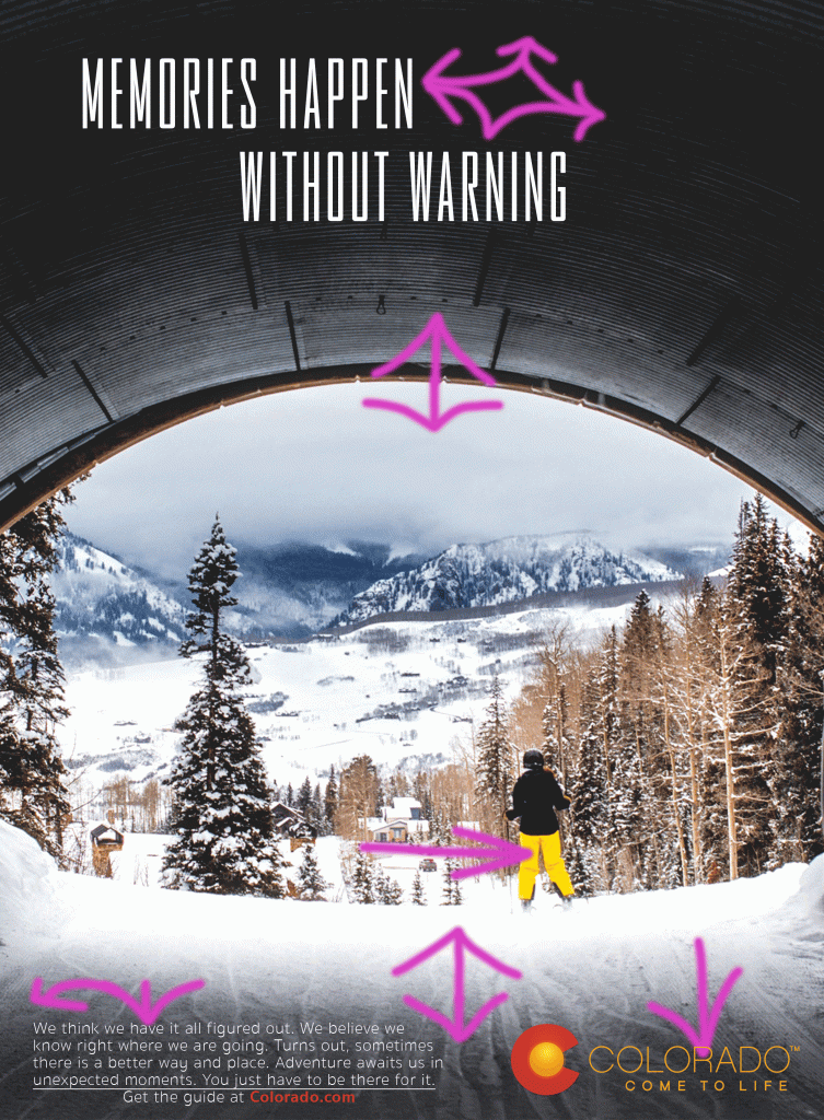
The design of this ad allows the reader to focus on the main image while the contrasting colors help move the eye around the page to the pertinent information. The white fonts against the dark backgrounds, the bright sky and snow coming out of the shadowed tunnel, and the bright yellow in the snow pants, brand and logo all compliment and contrast each other nicely.
alignment

The tunnel the skier just came through frames this ad well and leaves a great opportunity for optimal alignment in surrounding space. The heading floats in the rood of the tunnel while the body of text beside the logo and brand ground the information of the ad.
color
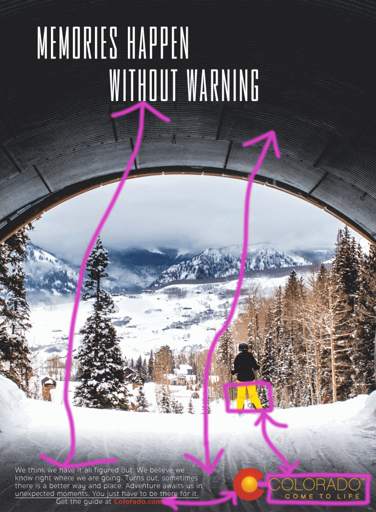
The colors in the design of this ad are what bring the message all together. The use and functions of color are identical to that of the design elements of contrast; the white fonts, the dark background, the yellow in the snow pants, brand and logo all compliment the main image of the Colorado scenery.
typography
As per the assignment instructions, this new ad and it’s elements match the original ad. The brand name and the main heading compliment each other with all caps sans serif fonts and contrast the typical sans serif body of text. Similarly to the original ad, I would like to see a more contrasting font as the main heading that better compliments the message trying to be conveyed.
Old vs New, It’s Up To You
I believe the two ads do not compete, rather they compliment one another. They each share a message to visit a beautiful place and make some unexpected memories. The ads are great companions by showing two different seasons and areas of that amazing state. This invites a diversity of audience and appeals to those with opposing interests or seasons of leisure.
